
Taking Snapshots of the Cultural Life of Cities
San Diego, Aug. 13, 2013 -- Do cities have their own visual DNA? According to new-media researcher Lev Manovich, they do, and this “visual signature” can be captured in the millions of photographs posted daily on social networks.
|
“We concluded that each city has its own unique visual signature,” said Manovich, a computer science professor at the City University of New York, and director of the Software Studies Initiative in Calit2’s Qualcomm Institute at the University of California, San Diego. “We previously used computer tools to analyze patterns in large data sets such as one million user-generated artworks and one million Manga pages, but this is the first time that we have focused on what cultural analytics can tell us about the places where we live.”
The Phototrails study is a partnership among The Graduate Center of CUNY, the Qualcomm Institute, and the History of Art and Architecture Department at the University of Pittsburgh.
|
The team’s findings were published in the July issue of First Monday*, an open-access, peer–reviewed online journal. All of the visualizations and findings are also available on the project’s Web site at http://phototrails.net.
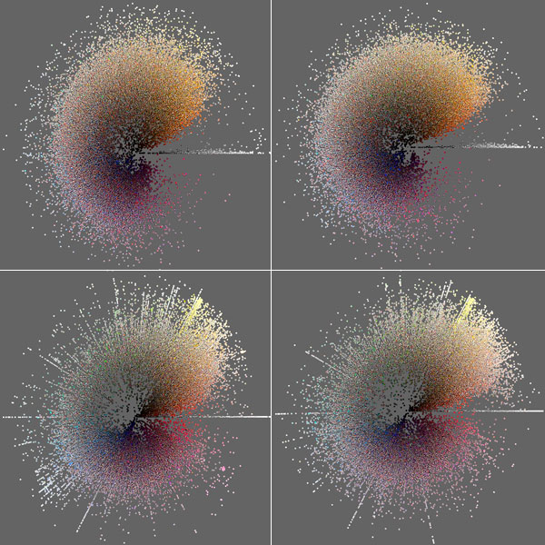
The study integrates methods from social computing, digital humanities and software studies to analyze what Manovich calls “big visual data.” To assess differences between cities, the team used information recorded by Instagram every time a photo is shared: date and time, geographic location, and filter aplied to the photo. In addiiton, they also processed photos to extract basic visual attributes such as mean, median, standard deviation, and histograms for brightness, hue, and saturation; the number of edges; contrast; and texture measurements.
|
“Our visualizations allow us to uncover the aggregated visual characteristics of each city as well as to examine the impact of exceptional events such as Hurricane Sandy,” said Phototrails investigator Nadav Hochman, a Ph.D. student in the History of Art and Architecture Department of the University of Pittsburgh.
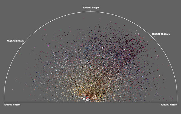
Beyond comparing the visual signatures of 13 global cities, the study went deeper into space and time patterns to explore specific cities and key events. In the wake of Hurricane Sandy, the researchers were able to analyze 23,000 Instagram photos from the Brooklyn area shared between November 29 and 30, 2012, when Sandy hit the New York area. A radial plot visualization of the user-generated photos shows a steep drop in the number of photos posted, and changes in hue, after the power (and most lights) went out (see image at right).
|
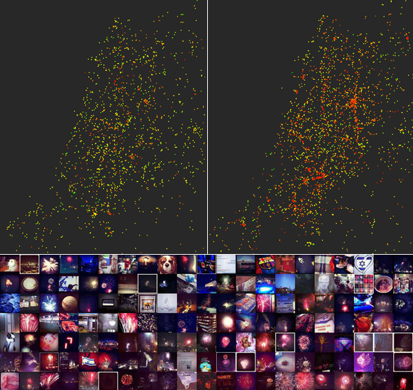
“We were interested to learn which social, cultural or political insights might be gleaned from spatio–temporal visualizations of the Instagram photos uploaded in one city over a three-month period of time,” said Manovich. “We also zoomed into the data to examine the patterns over a week, and also within a day.
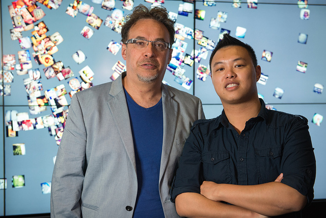
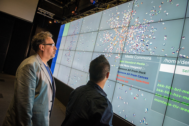
In addition to Hochman and Manovich, the Phototrails team includes a recent UC San Diego alumnus, Jay Chow, who majored in Interdisciplinary Computing and the Arts. Using the official application programming interface (API) provided by Instagram, the team “crawled” Instagram’s millions of publicly-shared photos and their metadata. “We analyzed every image and then visualized groups of images together using the software tools developed by the Software Studies Initiative in Calit2’s Qualcomm Institute,” explained Chow. “Our visualizations use different aspects of the data, and different layouts and techniques, in order to present the visual information in new and intriguing ways and to reveal patterns.”
|
The study looked at global patterns of Instagram use during a three-month period. The great majority of people only uploaded one or a few photos. The proportion of users who uploaded more than 30 photos varied significantly from city to city: only 2 percent in New York versus 6.8 percent in Istanbul and 10.9 percent in Tel Aviv, the city with the highest percentage of active Instagram users.
There are also sharp differences in the extent to which users take advantage of adding Instagram’s automatic filters to their photos before uploading them. Roughly 81 percent of photos from Tel Aviv were filtered, with London and San Francisco close behind. “But New York had the lowest percentage of filtered photos – just 68 percent,” said Manovich.”Why? The pace of life is hectic in the Big Apple, so it’s possible that New Yorkers are just too busy to take the extra time to find and apply the right filter before uploading the photo to Instagram.”
*N. Hochman and L. Manovich, “Zooming into an Instagram City: Reading the local through social media,” First Monday, July 2013.
Related Links
Phototrails
The Graduate Center, City University of New York
University of Pittsburgh Art Department
lab.softwarestudies.comSoftware Studies Initiative
Qualcomm Institute, California Institute for Telecommunications and Information Technology
Instagram
Media Contacts
Doug Ramsey, 858-822-5825, dramsey@ucsd.edu