
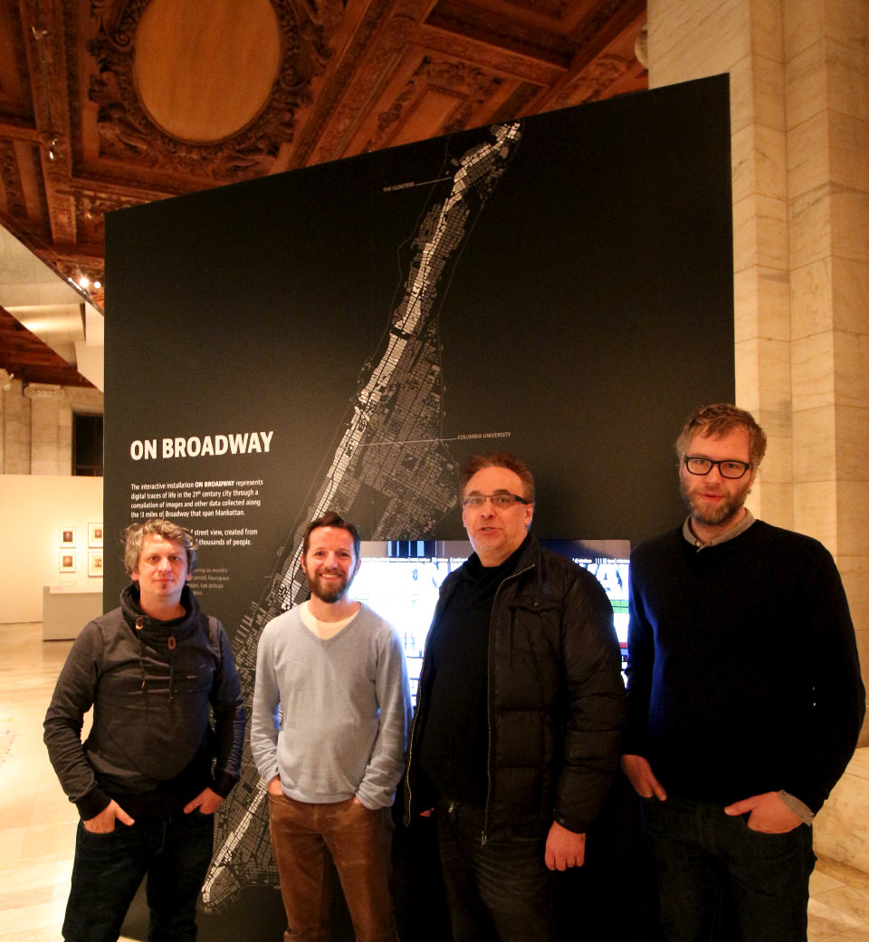
Broadway Bound: Interactive App and Exhibit Give Internet Users Deeper View of Manhattan Spine
December 15, 2015 — Unlike the Great White Way known to most out-of-towners visiting New York City, the Broadway portrayed in a new interactive work “On Broadway” is about the people and places that line the 13-mile length of the corridor spanning Manhattan from north to south.

“It’s a new type of city view,” said media artist and theorist Lev Manovich, a professor of Computer Science at The Graduate Center of the City University of New York (CUNY), and a research scientist in the Qualcomm Institute (the UC San Diego division of the California Institute for Telecommunications and Information Technology. “We are representing life in the 21st century city through a compilation of images and data created from the activities of hundreds of thousands of people. Being able to navigate all these images and data layers within a single application, in my opinion, really pushes the cutting edge of interactive visualization.” Manovich is also the director of the Qualcomm Institute’s Software Studies Initiative (softwarestudies.com).
“On Broadway” recently received a Silver Award in the annual competition for best visualizations of 2015 (http://www.informationisbeautifulawards.com/news/116-2015-the-winners) One of the highest recognitions in the data visualization field. “On Broadway” took the Silver in the Data Visualization Project category for 2015, one year after his previous large, interactive data project, “Selfiecity”, took the Gold in the same category in 2014.
Planning and data collection for “On Broadway” started in January 2014, and the team worked overtime for four months to complete “On Broadway” ahead of its unveiling at the New York Public Library last December. It was commissioned by the library as part of its “Public Eye: 175 Years of Sharing Photography” group exhibition. Fortunately, unlike most Broadway theatrical shows, this art exhibition was guaranteed a year-long run through January 3, 2016..
For the first few months, showing up at the library in person was the only way to take in the visually stunning mashup of images and data visualizations that reveals patterns in social media and other metrics at hyper-local level along the route that Fast Company magazine said traverses “New York’s rich cultural fabric from the Dominican neighborhood of Inwood to the heart of Chinatown.” Visitors to a number of other international exhibitions that opened in 2015 were also able to enjoy the “On Broadway” installation. These exhibitions include 2015 West Bund Biennial of Architecture and Contemporary Art (Shanghai, China), Biennial Graphic Design Festival (Breda, Netherlands), Data Traces (Riga, Latvia), The Digital Visual: an exhibition of information design (Kutztown University, Pennsylvania), and Data in the 21st Century (Rotterdam, Netherlands).
Now, however, there is an even easier way to experience the “On Broadway” installation: through an interactive web site (on-broadway.nyc) and software app (recommended for fast machines with large displays). The app puts the visuals and underlying data at the viewer’s fingertips. The app was originally built for the touchscreen at the library, so the metaphor is carried over to the web app. “It’s all about tapping and dragging,” says Dominikus Baur, a German mobile interaction designer who worked on the team developing “On Broadway”. “Tapping anywhere zooms in, dragging along Broadway moves all data layers. Alternatively, pinching can be used for zooming in or out, and a big, red reset button in the corner snaps the interface back to its initial state showing the full length of Broadway.”
Created by Manovich, his collaborators at Software Studies Initiative in the Qualcomm Institute, and an international team of artists and data visualization experts, including Moritz Stefaner, Dominikus Baur and Daniel Goddemeyer, “On Broadway” is an interactive, urban data visualization that attempts to represent what Manovich calls a “data city.”
“We did not want to show the data in a conventional way using only graphs and numbers. We also did not want to use another convention of showing spatial data with a map,” said Manovich. Instead, the team devised what he calls “a visually rich, image-centric interface, where numbers play only a secondary role, and no maps are used. We used a new visual metaphor for thinking about the city: a vertical stack of image and data layers.”
Manovich, Stefaner, Baur and Goddemeyer previously collaborated on the “Selfiecity” (selfiecity.net) project, in which they analyzed 3,200 selfies from five international cities to discern differences in the way urban dwellers perceive themselves and use social media. Other collaborators include Manovich’s colleagues in San Diego (Mehrdad Yazdani and Jay Chow) and at CUNY (Ph.D. students Agustin Indaco, Michelle Morales, Emanuel Moss, Alise Tifentale).
In order to offer an interactive app to viewers around the world, “On Broadway” required a powerful, custom-built computer to enable smooth, real-time transitions on the portal and app. To do so, Manovich worked with Calit2 Director Larry Smarr and others to deploy the computer utility, called Flash I/O Network Appliance (FIONA), a clonable, lab-scale display with PCs that have significant local processing/storage and advanced networking (with custom programming of Google tools also enhancing the graphical display of social media data).
There are 13 vertical layers representing images and data points aligned geographically. As the viewer “walks” down Broadway, one layer shows all buildings along the route (using Google Street View images). Viewers have the choice to take in the entire route at once, or to zoom in and meander more casually from one block to the next, and to zoom in further to connect the information on each layer to create a more complete picture of the life of the city on a block-by-block basis.
To construct the virtual version of Broadway, the team combined over 30 million images and data, including:
- 660,000 geo-coded Instagram photos shared along Broadway from February to July 2014;
- Twitter posts with images for the same period as the Instagram images (thanks to a Twitter Data Grant awarded to Manovich’s collaborator, Mehrdad Yazdani, at the Qualcomm Institute);
- 22 million taxi pickups and drop-offs in 2013 (used to represent movement within the metro area);
- 8,000,000+ Foursquare check-ins for 2009-2014;
- Google Street View images (variable dates); and
- Estimated average household income from the U.S. Census Bureau’s American Community Survey (2013).
For the latter, household income statistics are not available on a per-block basis. Instead, the census tracts are smaller than zip codes but still much larger than the Broadway spine that the team constructed from 713 spatial “slices”, each defined to be 30 meters long and 50 meters wide on each side of the street. With 73 census tracts overlapping these 713 slices of Broadway, average household income in each tract is displayed for all slices that lie inside it.
In addition to the above data, other layers were added to improve the richness of the visualization. In addition to showing facades on both sides of Broadway, the Google Street View images are used to generate a “top view” (i.e., what the section of Broadway looks like if you look upwards, which is particularly stunning in areas with tall buildings). The facades and storefronts are also parsed for visual information, notably the dominant color. The same technique is used to scan Instagram images and calculate dominant colors (shown on top of the actual Instagram photos taken at each location).
What emerges from the layers of images and data is a clear case of what the CUNY professor calls “one street, two cities.” “In affluent areas, people make more money, take taxis, and post images on Instagram and Twitter,” explained Manovich. “In poor areas, people make less money, rarely use taxis, and post many fewer images on social networks.”
Some of that discrepancy in the volume of social media posts can be attributed to tourists, who account for a large number of picture-takers in areas such as Times Square (which accounts for 13.5 percent of all Instagram images along Broadway). By contrast, from Harlem to the northern tip of Manhattan, there are practically no tourist images posted on Instagram.
To help viewers get oriented and navigate the data visualization, Manovich and his team also added layers indicating the locations of landmarks, cross streets and the names of Manhattan neighborhoods.
Related Links
Media Contacts
Doug Ramsey
(619) 379-2912
dramsey@ucsd.edu